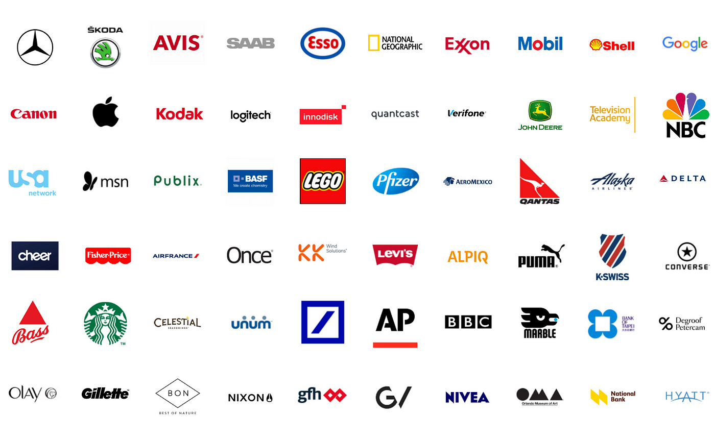
When you think of Apple, Nike, McDonald’s, or Coca-Cola, their logos pop into your mind instantly. They are simple, memorable, and timeless. But what makes a logo iconic? Why do some designs become global symbols while others fade into obscurity?
In this blog, we’ll break down the psychology, science, and strategy behind the world’s most iconic logos and why simplicity is the key to success.
The Science of Recognition: Why Simplicity Works
Your brain processes images 60,000 times faster than text. This is why logos are crucial in brand recognition. But not all logos are created equal. The most successful ones share these characteristics:
- Simplicity – Easy to recognize at a glance (Nike’s swoosh, Apple’s bitten apple).
- Versatility – Looks good on billboards, business cards, and even apps.
- Memorability – Sticks in the consumer’s mind (think of the golden arches of McDonald’s).
- Timelessness – Does not rely on trends that fade away.
Complex logos are hard to recognize and recall. That’s why companies like Starbucks, MasterCard, and Warner Bros. have simplified their logos over time.
The Psychology of Iconic Logos
Every great logo taps into psychological triggers that influence consumer perception:
- Color Psychology – Colors evoke emotions.
- Red (Coca-Cola, Netflix) = Energy, excitement, passion.
- Blue (Facebook, Samsung) = Trust, security, reliability.
- Yellow (McDonald’s, Snapchat) = Optimism, warmth, youthfulness.
- Black & White (Apple, Nike) = Luxury, minimalism, sophistication.
- Shape Psychology – Shapes affect brand perception.
- Circles (Pepsi, BMW) = Unity, inclusiveness.
- Squares (Microsoft, BBC) = Stability, strength.
- Triangles (Adidas, Mitsubishi) = Innovation, power.
Even the font choice plays a role. Serif fonts (e.g., Times New Roman) signal tradition, while sans-serif fonts (e.g., Google’s logo) convey modernity.
Case Studies: How Brands Built Iconic Logos
Nike: The Power of a Simple Swoosh
Nike’s Swoosh logo, created in 1971 for just $35, is one of the most recognizable symbols in the world. It represents motion and speed, aligning perfectly with the brand’s identity. Despite its simplicity, it is deeply tied to Nike’s “Just Do It” philosophy.
Apple: A Bite into Minimalism
Apple’s logo wasn’t always sleek and simple. It started as an intricate illustration of Isaac Newton sitting under an apple tree. But by 1977, Apple simplified it to the bitten apple, making it clean, modern, and memorable. The “bite” ensures that the apple isn’t mistaken for a cherry.
McDonald’s: The Golden Arches That Sell Happiness
McDonald’s golden arches are one of the most recognizable symbols in the world. The yellow color stimulates appetite, while the simple curved shape is easy to spot from afar. It’s a case study in effective brand psychology.
Google: A Playful Identity
Google’s logo has undergone several subtle refinements but has always kept its playful, colorful, and approachable identity. The primary colors (red, blue, yellow) with a hint of green represent breaking the rules and thinking differently.
Why Companies Keep Simplifying The Logo
If you compare today’s logos with older versions, you’ll notice a trend—brands are making their logos simpler.
- MasterCard removed its name and now just has two overlapping circles.
- Instagram moved from a detailed camera icon to a minimalist gradient.
- Warner Bros. flattened its logo for a cleaner look.
Why? Digital adaptation. Logos must look good on tiny app icons, social media, and smartwatches. Simplicity ensures that logos remain recognizable across all digital platforms.
The Takeaway: Simplicity = Timelessness
An iconic logo isn’t about adding more—it’s about removing everything unnecessary. The world’s biggest brands understand that:
Simplicity boosts recognition
Minimalism adapts to digital platforms
Color and shape psychology influence perception
Timeless logos evolve but never change drastically
Next time you see a famous logo, take a second to notice how simple yet powerful it really is.
What do you think? Which brand has the most iconic logo of all time? Drop your thoughts in the comments!


